Thursday, November 30, 2006

Tableaux

Week 9 at Art School - p.2


Today we were doing a Tableaux - what is THAT you ask ... well, according to the notes given to us, it is:

  • A picturesque presentation
  • A group of silent motionless persons arranged to represent a scene
  • A dramatic or effective situation brought about.
Basically, it was another photography project, but based on something that we could build, like a model, or set up, like a scene (think theater or set design). It could be quite surreal if needed be as well. It was quite open ended actually, and we were given lots of examples of what previous students had done, and people and things to think about:
  • Composition, framing, illusion, scale, lighting, animation, props, collage
  • 3D collage, Twin Peaks dream, Mariele Neudecker tanks, Boyd Webb actors, Guinness adds, mirrors, closeups, windows
  • Think about appearances, be individual, imaginative
  • Transformation. Transcend material. Not documentation
  • Is temporary. For the camera only, not just model making
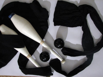
Unfortunately, we were only told about this the day before, so most of us turned up with limited props and ideas. Whilst the full timers had 3 days to experiment and come up with a working concept, us part timers only had this afternoon (although according to the tutors the reason they chose this project for us is that we can easily go off home and do it in our own time). Anyways, I came in with some of Sunshine's juggling balls and some architectural model mini airplanes that I'd come across, and some other bits an bobs. I can't say I'm happy with what I've produced, and will probably want to take another set of photos, but here is my favourites of this lot:

Wednesday, November 29, 2006

Digital Image Manipulation

Week 9 at Art School - p.1

Today we were mostly in the IT workshop getting a quick tour of Photoshop. None of it was really new to me as I'd played with Photoshop before - so it was mostly getting used to the Macs (I use a PC) and seeing how quickly I could get things done. Considering I used to find "layers" an absolutely ungraspable concept - I've come a long way in the last year or so. Thank you to Sunshine for being my in-house Adobe tutor!

We had to manipulate a picture of ourselves and here are my results (top left is the original picture):

Art and design history lecture today was about the Bauhaus school. We also got to see a short clip from the Austrian director Fritz Lang's film "Metropolis" from the same era.

Thursday, November 23, 2006

Natural Object 3D project

Week 8 at Art School - p.2

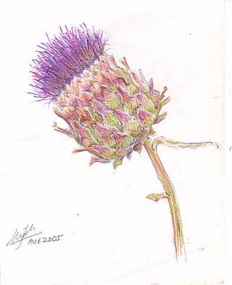
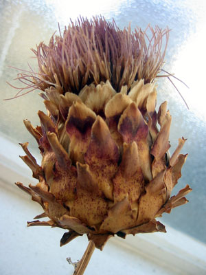
Last week we were set homework to go away and pick a natural object and do some drawing studies of it. I chose a dried artichoke thistle (originally given to me by Sunshine's mum - cut from their back garden) because I'd done a colour pencil study of one last year, and really liked its shape and texture (on the left my original colour study, on the right the dried one I used today).


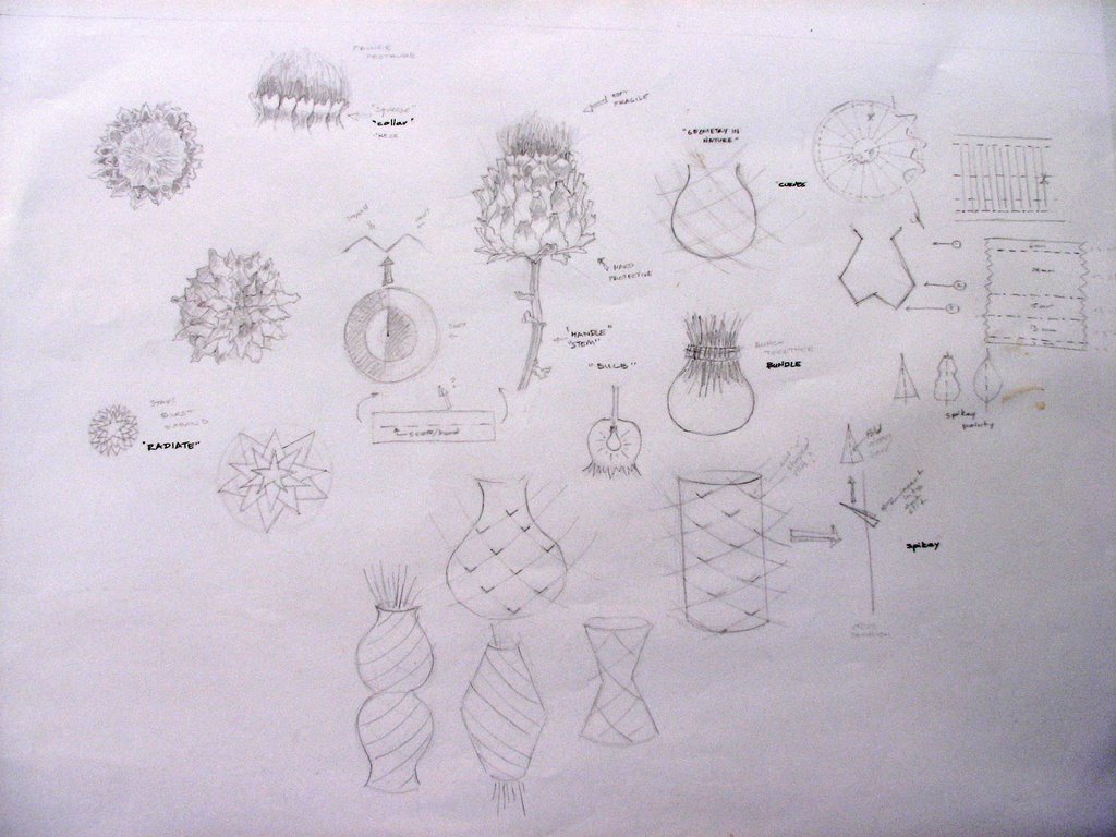
We came in today armed with our studies and then went on to do some abstractions and started drawing some ideas for 3D objects based on our studies and abstractions. Our tutor also suggested writing words that came to mind that either described the object or some emotion related to it. We were not constrained to the original object and could go off in any tangent we wanted. The excercise isn't to build a model of our chosen object, but to use it as inspiration.


I was quite inspired by how the soft bristles were bundled in the main flower, the spiky skin, the way the spikes followed a very geometric curve around the bulb, and also by the radial quality of the bottom of the flower. I went with those concepts and started experimenting with bits of paper, card, paper plates and pins.

Warning: slide show may take a while to upload - 55 pictures!


I now have till next Thursday to made something more substantial from my tests, and present it at my first ever critique! Wish me luck ...

Links: project brief and notes.

Wednesday, November 22, 2006

More contextualizing ...

Week 8 at Art School - p.1

After our project brief from last week, I decided that I wanted to focus on a couple of pieces that I had actually used in my portfolio to get into the course I'm on. One is a collaged letter A made out of bits of a cut up atlas. It was done as a project run by Sunshine's sister.
My original inspiration for this had been a piece in the Tate Modern by Layla Curtis called "United Kingdom" (click on the photo for more info about it).

Today I've been doing research in the library and got hold of a book with a lot of cartography inspired art called "You are here" which has already given me lots of leads.

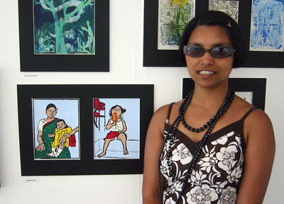
The other piece I've chosen to work with is a screen print I made based on a very old photo of a very young me! (It's the "girl with ice cream" piece - this photo incidentally was taken last summer at our adult education classes end of year exhibition)


The obvious first choice of inspiration is of course Andy Warhol (click on the picture for more info about it).


I've also been looking into other pop-art inspired leads for artists doing things using photographs as source material and very flat colour usage. Hopefully I'll have it all collated soon and can put a link to my finished project up here.

Art and design history lecture today was "Futurism (from Italy), Constructivism (from Russia) and the De Stijl group (from the Netherlands)".

Monday, November 20, 2006

Mixed media art

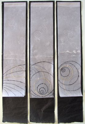
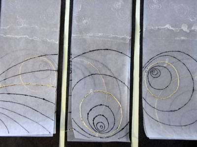
I've spent the last few days finishing off the homework from the creative drawing project. Above is the final piece and below a detail from it:

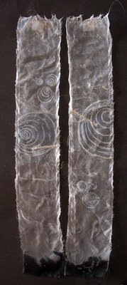
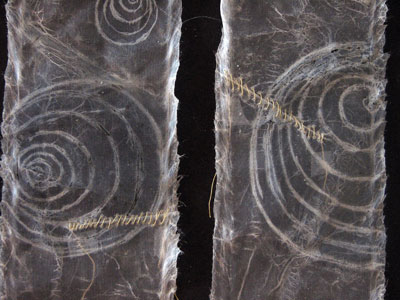
The scratched wax work is quite subtle and it looks much better in real life than in these pictures. Here's a slide show showing how I made them:


A hazard of not having your own space to work in is that sometimes accidents happen. The Flatmate managed to use the cutting mat without making sure there was nothing on it - and sliced a line into a piece of work. To balance things I sliced the piece that was paired with it, and sew up both cuts with yellow/gold tread as a detail.

Thursday, November 16, 2006

Photographic practice

Week 7 at Art School - p.2


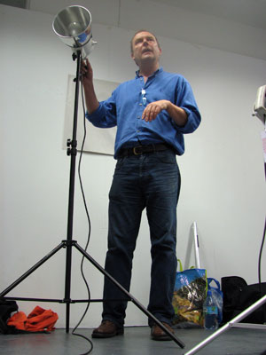
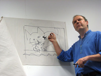
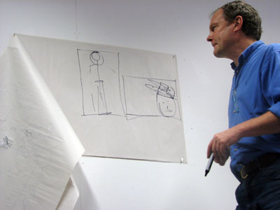
This is Dave Hobson, one of our tutors, explaining to us what we were about to do the rest of the day.

Last week we were told to "... bring with you a broad and good selection of materials, devices, and objects that you can use to dress, exaggerate, decorate, extend, deform, distort, emphasize and adorn the whole or part of the body ..." We all came in with all sorts of props and paraphanelia - I mostly brought in Sunshine's juggling things as I thought they'd be different from everyone else's.

Dave quickly went through with us about "framing" photographs, and reminded us that the aim of the day wasn't so much the getting the "costume" right, but more about exploring what we could achieve with our photography of the subject.


We were paired up and had to dress up and "art direct" our partner, and take photographs of her/him (and then they did the same to us). I worked with Emma who wrapped me up in a big sheet of plastic and adorned me with silk flowers (and a metal egg basket on my head!). I on the other hand did some interesting things with: a black poloneck jumper, a pair of black tights, a couple of black acrylic balls, and a pair of juggling clubs ...


Used The Flatemate's film camera, and have deposited the film for developing - can't wait to see the results!

Wednesday, November 15, 2006

Contextualizing my work 1

Week 7 at Art School - p.1

Today we were mostly at the "Integrated Learning Resource Centre" - or ILRC - just a glorified name for our library. The ILRC project is mostly about us putting our work in context of what has gone before and what it is like. We are to pick a couple of pieces of our own work (from what we've been doing on the course, or outside, old or new) and then find for each piece, four images that relate to them, and get good and relevant quotes from the artists that have produced the work.

We were given a full tour of the library and its facilities - I'd seen most of the books bit, but now realised they had much more than that (magazines, videos, DVDs, - and TVs to watch then on, audio CDs, CD-roms, slides, computers with photo and video editing software, scanners, printers - including a huge plan size printer, other book binding facilities, a couple of rooms set up with lights and platforms for taking photos of artwork, a materials library with samples and stuff, and a big space with drawing boards, big cutting mats, tables and guillotines for putting together presentations and stuff). It catered well for art students - I'm going to try and make the most of it ...

Anyways, back to the project, we've basically been given next Wednesday morning as free time to wonder round the ILRC to research artists who have done similar work to ours, and then produce a booklet which includes a 250 words summary of how all those artists and their work relates to ours. I'm not entirely sure how to start on this. I might actually do it the other way round and find artists and work that I like and then produce a piece of work influenced by my findings. I don't know yet ... I'm not comfortable with this kind of academic stuff. Fortunately this doesn't need to be in until January.

Eeeep!

Monday, November 13, 2006

Video links

I thought I'd make an entry of art-related videos that I've come across in the last year or so - mainly so that I don't have to keep digging them out whenever I want to show them to other people ...

Murals by group of Japanese artists:
"One Week of Art Works"

"Puzzle"


Korean sand art to one of my favourite tracks - "Kojiki" by Kitaro


A young portrait artist called Jason Rudolph Pena:
"Zach Galifianakis Portrait Painting"

"Claudia's Colours"

"The Ink Drawing"


Funky alien plant animation "Alias - Sixes Last"


Another couple of lovely animations:
"An Eye for Anai" by Jon Klassen.
"En tus brazos" Tango by a French(?) group.
Both really lovely story telling.

Thursday, November 09, 2006

Colour Theory

Week 6 at Art School - p.2


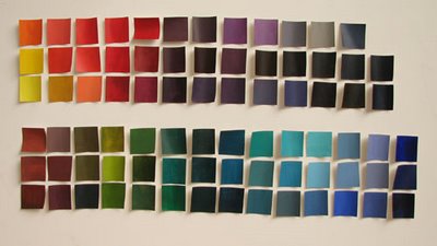
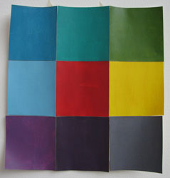
Our day today was all about colour theory with tutor Chris. The exercise was to make lots and lots of coloured squares - not the usual colour wheel, but just random colours. We all drew at least two sheets with 40 5cm by 5cm square boxes and stuck them to the walls. Then off we went with our acrylics. He didn't care whether we kept track of what colour we were mixing - it was more about just being free. He also suggested "chasing" a colour - as in if we found a colour we liked, to keep adding other colours to see what we got. Do one sheet first, then see what range of values we had - lots of dark colours, then make the second sheet with more light colours, and vice versa. At the end of the day we cut all the squares out and went home with those to do our homework. I came home and stuck them on the wall to have a look (above).

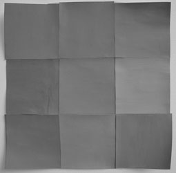
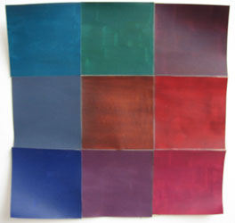
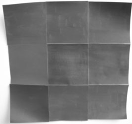
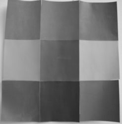
Homework was to make two sets of 9 squares of the same tonal value and one set of 9 with a mix of values. I cheated and looked at the squares through the digital camera set on black & white, which allows you to see clearly the values.

Light set:

Dark set:

Mixed set:


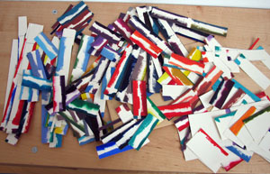
This is as far as I've got - the rest of the homework is to do some paintings based on these sets, and also to do something with the off-cuts (below, the bits of colour that spread out from the 5x5 boxes we were painting in). Lots to do!


Chris also suggested a few books if we were interested in colour and its use:
"Colour and Culture" by John Gage
"Interaction of Colour" by Josef Albers
"Elements of Colour" by Johannes Itten
"Colour Codes" by Charles A RileyII
"Basic Colour" by Egbert Jacobson (1948, Basic Color: An Interpretation of the Ostwald Color System, Chicago Theobald - out of print)

Wednesday, November 08, 2006

Printmaking 2 (Collagraphy)

Week 6 at Art School - p.1

Printmaking workshop today was really satisfying. I loved the process of inking up and printing (despite the white spirit fumes - prefer water based inks myself!) ... could really get into this :)


Watch a slide show of the process here (mouse over each picture for a short description):

Thanks to Laura for taking the photos of me (yes I know, cheesy grins) and Dervin for the link to the slide maker.

Art and design history lecture today was "The Impact of Modernism - Cubism". Rather than speaking at us, Georgina showed us an episode from an old (1980) BBC documentary called "The Shock of the New" (the episode was the "Mechanical Paradise" one). There's a book based on the series too - must try and get hold of a copy to read ...

Monday, November 06, 2006

White on Black

I had a bit of an odd day today - and was feeling mentally fatigued. Sunshine suggested I do some drawing to clear my head so I decided to start on my new black sketchbook. Well, it's not that new really, but I just hadn't gotten round to doing anything with it. Then I saw Jana's lantern and was inspired. I did about 8 drawings and here's my favourite 4.


All done using a Pentel Hybrid white pigment gel ink pen.

Thursday, November 02, 2006

Creative Drawing

Week 5 at Art School - p.2

Yay! Another drawing day!!! I've been really enjoying the creative drawing classes we've been doing - and we had another one today. We started with just some simple mark making studies. We masked off squares on our big sheet of paper, then drew with a kebab-skewers dipped in Quink (watersoluble ink). Each box was the study of a letter, number or shape (the slightly grainy effect is where I've first drawn in with a candle stick to make the ink resist the surface).

In the afternoon the tutor came in with bleach, melted wax (and an iron), tracing paper, tissue paper, bits of fabric, needle and tread, and pins, and left us to experiment ... I loved it! Here are some of my results:


Wednesday, November 01, 2006

Printmaking 1 (Collagraphy)

Week 5 at Art School - p.1

This week's workshop was printmaking. I've been really looking forward to this as I did some printmaking (monoprinting and screen printing) last year and absolutely loved it. I even had some of my prints in my portfolio when I interviewed for this course and I know they went down well. At this workshop we were going to do collography. The beauty of collography is that it's cheap, and can be used as both an intaglio or a relief method of print.

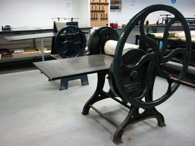
The tutor and the technician demonstrated how to make "plates", the actual inking up process and also how to print. The two antiquated looking things above are the printing presses we are going to be using. We also got to see some other students work for inspiration. Then we were all given small pieces of mountboard to play with and sent off to make some plates with them, using blades and other sharp, pokey things. We have till next week to get them done and then covered in several coats of shellac (sealant to strengthen the plates because they are subjected to lots of pressure). I think I'll do two - one with lots of bits carved out, and another with things built up on the surface. Inking up and printing will be next week so watch this space for the finished prints!

Art and design history lecture today was about Art Nouveau and the Vienna Secession - some of my favourite styles of art. The lecturer showed us a picture of the Glasgow School of Art designed by Charles Rennie Macintosh - man what I wouldn't give to study there!